Posicionando elementos com Flexbox em CSS
- #CSS
# Projeto Integrador
*{
margin: 0;
padding: 0;
font-family: 'Open Sans', sans-serif;
}
ul{
list-style: none;
margin: 0;
padding: 0;
}
ul li a{
text-decoration: none;
}
div img{
display: block;
width: 100%;
}
.flex-container{
display: flex;
max-width: 992px;
margin: auto;
width: 100%;
min-width: 320px;
}
header{
background-color: #122A57;
height: 100px;
display: flex;
align-items: center;
color: #fff;
}
header .list-items{
display: flex;
max-width: 260px;
width: 100%;
justify-content: space-between;
align-items: center;
}
.list-items li a{
color: #fff;
}
header .menu{
justify-content: space-between;
}
.apresentação{
height: 100vh;
align-items: center;
justify-content: space-between;
}
.apresentação .texto-apresentação{
min-height: 200px;
}
.texto-apresentação h1{
color: #122A57;
font-size: 48px;
margin-bottom: 10px;
}
.btn{
background-color: #122A57;
color: #fff;
text-align: center;
border-radius: 30px;
width: 220px;
display: block;
text-decoration: none;
height: 50px;
line-height: 50px;
margin-top: 10px;
margin-bottom: 10px;
}
#quem-somos{
flex-direction: row-reverse;
align-items: center;
justify-content: space-between;
}
#quem-somos h2{
font-size: 32px;
color: #122A57;
display: flex;
margin-bottom: 20px;
}
#quem-somos h2::before{
content: "";
height: 50px;
width: 5px;
margin-right: 5px;
background-color: #122A57;
position: relative;
}
#quem-somos p{
margin-bottom: 10px;
width: 90%;
}
#quem-somos img{
min-width: 420px;
}
.container-externo{
background-color: #122A57;
width: 100%;
}
#servicos{
flex-direction: column;
padding-top: 50px;
padding-bottom: 100px;
}
#servicos h2{
color: #fff;
font-size: 32px;
margin-bottom: 20px;
}
.list-servicos{
display: flex;
justify-content: space-between;
}
.list-servicos .item-servico{
text-align: center;
}
.item-servico a{
width: 220px;
background-color: #fff;
border-radius: 30px;
height: 50px;
text-align: center;
margin-top: 20px;
line-height: 50px;
padding: 5px 10px;
color: #122A57;
font-size: 12px;
text-decoration: none;
font-weight: 700;
}
.item-servico p{
font-weight: 700;
font-size: 18px;
color: #fff;
margin-top: 20px;
}
.item-servico img{
width: 80%;
margin: auto;
}
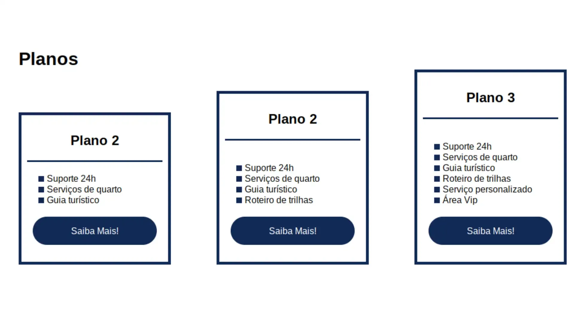
#planos{
flex-direction: column;
min-height: 100vh;
margin-top: 50px;
}
#planos h2{
font-size: 32px;
padding-top: 50px;
}
.list-planos{
display: flex;
align-items: flex-end;
justify-content: space-between;
}
.item-plano{
flex: 1;
border: 5px solid #122A57;
margin-right: 20px;
padding: 10px;
max-width: 240px;
}
.item-plano .btn{
margin: auto;
margin-bottom: 20px;
}
.item-plano h3{
font-size: 24px;
display: flex;
flex-direction: column;
text-align: center;
margin-top: 20px;
}
.item-plano h3::after{
content: "";
background-color: #122A57;
width: 100%;
height: 3px;
margin-top: 20px;
margin-bottom: 10px;
}
.item-plano ul{
padding: 10px 20px;
display: flex;
flex-direction: column;
margin-bottom: 10px;
}
.item-plano ul li{
display: flex;
flex-wrap: nowrap;
align-items: center;
}
.item-plano ul li::before{
content: "";
width: 10px;
height: 10px;
background-color: #122A57;
margin-right: 5px;
}
footer{
background-color: #122A57;
height: 70px;
display: flex;
align-items: center;
}
footer .footer{
justify-content: space-between;
color: #fff;
}
/*mobile*/
@media(max-width:992px){
.flex-container{
flex-direction: column;
}
.apresentação{
flex-direction: column-reverse;
}
.apresentação .texto-apresentação{
width: 100%;
}
#quem-somos{
flex-direction: column-reverse;
}
#quem-somos img{
min-width: 320px;
margin: auto;
}
.list-servicos{
flex-direction: column;
}
.item-servico img{
width: 50%;
margin: auto;
}
.list-planos{
flex-direction: column;
align-items: flex-start;
margin-bottom: 20px
}
;.list-planos .item-plano{
max-width: 90%;
margin: auto;
height: 100%;
margin-bottom: 20px;
}
}
Aula da Professora Karen Santos da Dio no Santander Bootcamp Fullstack Developer
[Flex Projeto](https://github.com/Sandradiotech/Flex_Projeto/tree/main/Flexbox)